
Horsham Society: Chromophobia, red doors and greige
See the latest news from Your World at https://www.sussexexpress.co.uk/your-world
This weeks column is by Oliver Farley
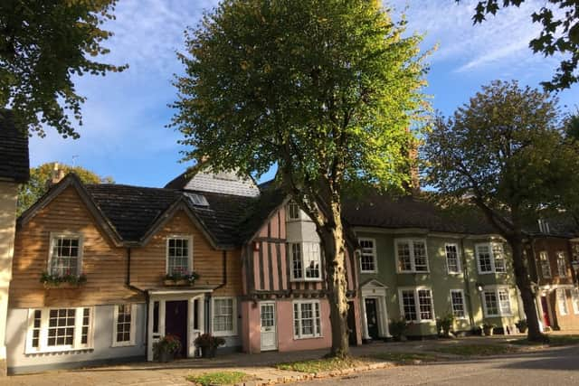

Horsham had a problem with colour some time ago; an estate agent, newly established in the Carfax, painted their facade a dull mulberry red. Protests were made and after several months the listed building returned to white.
Listed means historic, historic means revered, revered means tradition, and tradition hints at Classicism, therefore the Renaissance and gleaming white statues in Pentelic marble.
Are we afraid of colour? While the term chromophobic, it’s not proven completely for Horsham. Older buildings with Horsham stone roofs and of multi-bay half-timber construction are usually white but a stroll to the Causeway reveals rendering in much merrier shades. The Museum is a leafy green, neighbours are pink, blue and green again, while doors vary from finished wood to purple. Indeed, doors grant a licence to owners to abandon restraint and reveal their reckless side. A shocking pink door has admittedly been repainted grey, but a buttery yellow isn’t hard to find.
The Bosnian poet Vojka Djikic tells us that “..when we mend the roof, and paint the red door red, a guest may come.” A pleasing prospect from a portal.
By contrast, so much of modern electronics are black, silver or grey that the term greige has been deployed. (Financial Times, Edwin Heathcote, Architectural Correspondent 22/08/2026) Apparently, these colours are said to convey seriousness and earnest purpose. Hence black cameras and dull PCs. Grey has even become endemic for cars.
An offset to seriousness is found in decorative detail, and surprisingly frequently in the buildings from those imposing conservatives, Victorians and Edwardians. Look at the mouldings on the houses along Hurst Road at the station end, set into the brickwork are string lines, keystones and arches, entwinned around every door and windows at each level, all picked out in white against the warm red brick.
And what could be more playful than Post Modernism, that rebellious movement of the 1960s – ‘70s using comical faux Classicism to debunk past sobriety? Our own clever example is Parkside, declaring its origins as 1994, rather late for Post-Modernism, but undoubtedly part of it, as shown by the toy style engaged pillars in front and the blue tiles around the porthole windows. There’s a Japanese flavour to the fenestration, adding to the sense of mixed metaphors giving nevertheless a pleasing result.
Perhaps the most spectacular yet purposeful use of colour is that of the Allianz Arena in Munich. Built to house two teams, its walls are transparent plastic pillows which can be left white or turned red or blue by interior lighting according to which team is hosting the game.
Horsham Society is one of the sponsors of Horsham Football Club so there’s a precedent here for spectacular architecture to enliven the game. However, the Allianz cost over 250 million pounds back in 2004, the Society will have to attract many more members before Horsham gains a legendary stadium.
For more information see www.horshamsociety.org